Android Material Design的使用(一)- MaterialButton篇
前言 本系列将要介绍Material design库包含的所有控件,com.google.android.material:material:1.4.0 讲解
MaterialButton是Google于SDK28推出的新控件,当遇到按钮需要圆角、或者描边等,就不必使用xml文件或者Github上找第三方库实现。
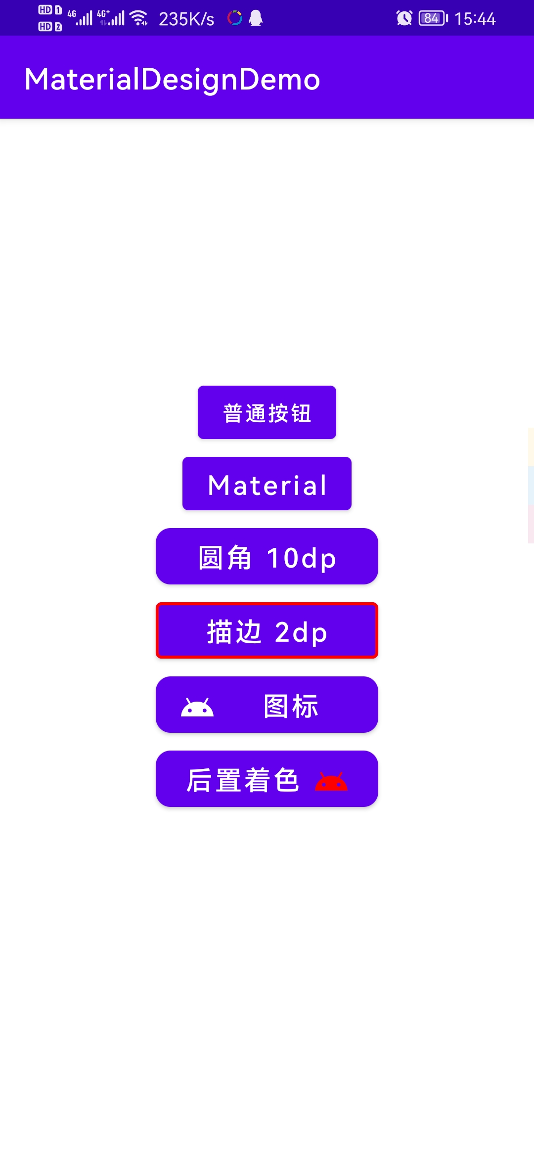
效果图
实际运用 效果如图片最后一个按钮
1 2 3 4 5 6 7 8 9 10 11 12 <com.google.android.material.button.MaterialButton android:layout_width ="150dp" android:layout_height ="50dp" android:text ="后置着色" android:textAllCaps ="false" android:textColor ="@android:color/white" android:textSize ="18sp" android:theme ="@style/Theme.MaterialComponents.Light.NoActionBar" app:cornerRadius ="10dp" app:icon ="@drawable/ic_android_black_24dp" app:iconGravity ="textEnd" app:iconTint ="#ff0000" />
啥?闪退了?那就删除吧
关于闪退问题 在v1.1.0以后,使用MD控件可能会出现闪退的问题,原因是未将theme设置为MaterialComponents,解决方法如下:
方法一 在控件中添加
1 android:theme="@style/Theme.MaterialComponents.Light.NoActionBar"
即可解决
方法二 1 2 3 <style name ="MaterialComponents_Theme" parent ="Theme.MaterialComponents.Light.NoActionBar" > ... </style >
然后设置App主题为@style/MaterialComponents_Theme即可
常见问题 关于Background note quote All attributes from MaterialButton are supported. Do not use the android:background attribute. MaterialButton manages its own background drawable, and setting a new background means MaterialButton can no longer guarantee that the new attributes it introduces will function properly. If the default background is changed, MaterialButton cannot guarantee well-defined behavior.
大意就是不可以使用android:background设置背景,会破坏MaterialButton本身的绘制,而设置背景则推荐使用app:backgroundTint
关于insetTop、insetBottom MaterialButton创建后,按钮实际长度并不是设定值,因为它上下有留空,可以使用
1
2
android:insetBottom="0dp" android:insetTop="0dp"
去除。
去除阴影 MD控件默认有阴影效果,但是有时候我们并不想要按钮有阴影,那么这时候可以指定style为
1 style="@style/Widget.MaterialComponents.Button.UnelevatedButton"
这样就能去掉阴影,让视图看起来扁平化。
公开属性
属性
描述
参数
app:backgroundTint
背景着色
默认为?attr/colorPrimary
app:backgroundTintMode
着色模式
add,multiply,screen,src_atop,src_in,src_over
app:strokeColor
描边颜色
app:strokeWidth
描边宽度
app:cornerRadius
圆角大小
app:rippleColor
按压水波纹颜色
app:icon
图标icon
app:iconSize
图标大小
app:iconGravity
图标重心
start,end.textStart,textEnd
app:iconTint
图标着色
app:iconTintMode
图标着色模式
add,multiply,screen,src_atop,src_in,src_over
app:iconPadding
图标和文本之间的间距
项目完整源码 1 2 3 4 5 6 7 8 9 10 11 12 13 14 15 16 17 18 19 20 21 22 23 24 25 26 27 28 29 30 31 32 33 34 35 36 37 38 39 40 41 42 43 44 45 46 47 48 49 50 51 52 53 54 55 56 57 58 59 60 61 62 63 64 65 66 67 68 69 <?xml version="1.0" encoding="utf-8" ?> <LinearLayout xmlns:android="http://schemas.android.com/apk/res/android" xmlns:app="http://schemas.android.com/apk/res-auto" xmlns:tools="http://schemas.android.com/tools" android:layout_width="match_parent" android:layout_height="match_parent" android:gravity="center" android:orientation="vertical" > <Button android:layout_width="wrap_content" android:layout_height="wrap_content" android:text="普通按钮" /> <com.google.android.material.button.MaterialButton android:layout_width="wrap_content" android:layout_height="wrap_content" android:text="Material" android:textAllCaps="false" android:textColor="@android:color/white" android:textSize="18sp" android:theme="@style/Theme.MaterialComponents.Light.NoActionBar" /> <com.google.android.material.button.MaterialButton android:layout_width="150dp" android:layout_height="50dp" android:text="圆角 10dp" android:textAllCaps="false" android:textColor="@android:color/white" android:textSize="18sp" android:theme="@style/Theme.MaterialComponents.Light.NoActionBar" app:cornerRadius="10dp" /> <com.google.android.material.button.MaterialButton android:layout_width="150dp" android:layout_height="50dp" android:text="描边 2dp" android:textAllCaps="false" android:textColor="@android:color/white" android:textSize="18sp" android:theme="@style/Theme.MaterialComponents.Light.NoActionBar" app:strokeColor="#ff0000" app:strokeWidth="2dp" /> <com.google.android.material.button.MaterialButton android:layout_width="150dp" android:layout_height="50dp" android:text="图标" android:textAllCaps="false" android:textColor="@android:color/white" android:textSize="18sp" android:theme="@style/Theme.MaterialComponents.Light.NoActionBar" app:cornerRadius="10dp" app:icon="@drawable/ic_android_black_24dp" /> <com.google.android.material.button.MaterialButton android:layout_width="150dp" android:layout_height="50dp" android:text="后置着色" android:textAllCaps="false" android:textColor="@android:color/white" android:textSize="18sp" android:theme="@style/Theme.MaterialComponents.Light.NoActionBar" app:cornerRadius="10dp" app:icon="@drawable/ic_android_black_24dp" app:iconGravity="textEnd" app:iconTint="#ff0000" /> </LinearLayout>
类似一个LinearLayout,但只能添加MaterialButton,只有第一个子元素的最左边角和最后一个子元素的最右边角才能保留它们的形状外观或角大小,类似于iOS中的SegmentedControl,
举个栗子 布局源码 1 2 3 4 5 6 7 8 9 10 11 12 13 14 15 16 17 18 19 20 21 22 23 24 25 26 27 28 29 30 31 32 33 34 <?xml version="1.0" encoding="utf-8" ?> <com.google.android.material.button.MaterialButtonToggleGroup xmlns:android ="http://schemas.android.com/apk/res/android" xmlns:app ="http://schemas.android.com/apk/res-auto" android:id ="@+id/toggleGroup" android:layout_width ="match_parent" android:layout_height ="match_parent" app:checkedButton ="@id/btn1" app:singleSelection ="true" > <com.google.android.material.button.MaterialButton android:id ="@+id/btn1" style ="@style/Widget.MaterialComponents.Button.OutlinedButton" android:layout_width ="wrap_content" android:layout_height ="wrap_content" android:text ="选项一" android:theme ="@style/Theme.MaterialComponents.Light.NoActionBar" /> <com.google.android.material.button.MaterialButton android:id ="@+id/btn2" style ="@style/Widget.MaterialComponents.Button.OutlinedButton" android:layout_width ="wrap_content" android:layout_height ="wrap_content" android:text ="选项二" android:theme ="@style/Theme.MaterialComponents.Light.NoActionBar" /> <com.google.android.material.button.MaterialButton android:id ="@+id/btn3" style ="@style/Widget.MaterialComponents.Button.OutlinedButton" android:layout_width ="wrap_content" android:layout_height ="wrap_content" android:text ="选项三" android:theme ="@style/Theme.MaterialComponents.Light.NoActionBar" /> </com.google.android.material.button.MaterialButtonToggleGroup >
监听方法 1 2 3 4 5 6 7 MaterialButtonToggleGroup materialButtonToggleGroup = findViewById(R.id.toggleGroup);materialButtonToggleGroup.addOnButtonCheckedListener(new MaterialButtonToggleGroup .OnButtonCheckedListener() { @Override public void onButtonChecked (MaterialButtonToggleGroup group, int checkedId, boolean isChecked) { Toast.makeText(MainActivity.this , "ID:" + checkedId + ", checked:" + isChecked, Toast.LENGTH_SHORT).show(); } });
公开属性
属性
描述
参数
app:checkedButton
默认选中
按钮ID
app:singleSelection
是否单项选择
true/false
app:selectionRequired
设置为true后,强制至少选中一个
true/false
